The human mind is wired to create stories from pictures which is why charts are one of the quickest ways to communicate the narratives that data can tell. Very few people actually enjoy staring at raw 1’s and 0’s, and most need at least a little guidance to help them digest numbers quickly. This is where colors, shapes, lines, and bit of text can really speed up understanding and reaction. In this quick tutorial, you’ll learn how to transform lists of data into meaningful messages that your team and customers can use to better understand what you’re trying to communicate.
Graphs vs Charts
We use these words interchangeably, but there is actually a distinction. Graphs are more basic, like a simple display of data point values over time. Charts can be more complex, allowing you to compare many values and segments of values relative to the overall data set. Charts are also considered to be more visual since they naturally allow for more dimension than just simple x- and y-axes.
To know which to use when, you need to first understand the story you want to tell. Simply put: what is the question that you’re hoping to find an answer to? Do you want to know how many products your company has sold by month for the last year? That can probably be handled with a simple line graph. Or do you want to know how much your profit margin was affected by rainy days in the last year? You’ll probably want a combination chart. Knowing your question will help keep your visualization from getting bogged down in data overload while making sure the most important data points are there.
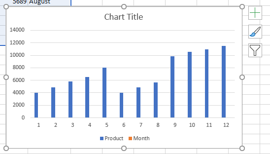
Create a Simple Graph
Let’s say you just want to show the relationship between two columns, like how many products your company sold by month for the last year. Just highlight the two columns, right-click the highlighted data, and select ‘Quick Analysis’.
Quick and Simple
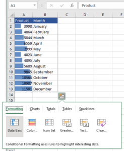
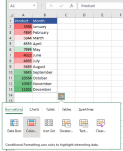
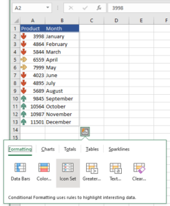
You can show the simple relationship in the data columns themselves which is great when you want to quickly communicate information, usually internally. All you do is use the ‘Formatting’ option that focuses on your main message.
- Data Bars show the overall trending relationship
- Color Scales can relate data in a heat map sense
- Icon Sets quickly show which direction the data is trending
To customize these options—like colors, icons, and value criteria—keep your data highlighted and click on the Home tab > Conditional Formatting > New Rule then follow the wizard.
Formal and Professional
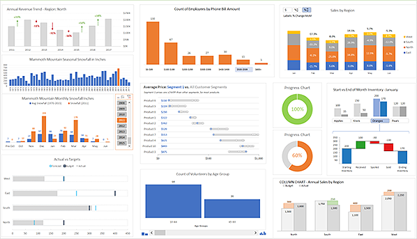
A separate, drag-and-drop visual can be created in a similar way, but it includes labels as well as a chart name and more differentiated graphics. These are the kinds of graphs you expect to see in a formal report, and they are more professional looking when sharing with people outside of your organization. For these, use the ‘Charts’ options which will give you basic layouts that include bars and lines in both vertical and horizontal layouts.
To customize the graph, click on the chart pop-out and use the menu on the right that appears.
- Plus sign – customizes the chart elements you see such as the legend and labels
- Paint brush – customizes the look and aesthetics such as color and format
- Funnel – customizes the data that makes up your graph
Create a Complex Chart
You can also use the Quick and Simple method mentioned above if you have a pretty simple set of data, but typically charts are pulled in when the data that you’re highlighting has layered relationships. So, if you’d like to know how much your overall profit margin changed based on the number of rainy days there were per month, you’ll need to use a combination chart. This and many other complex visualizations can be found in the Insert tab’s Charts area.
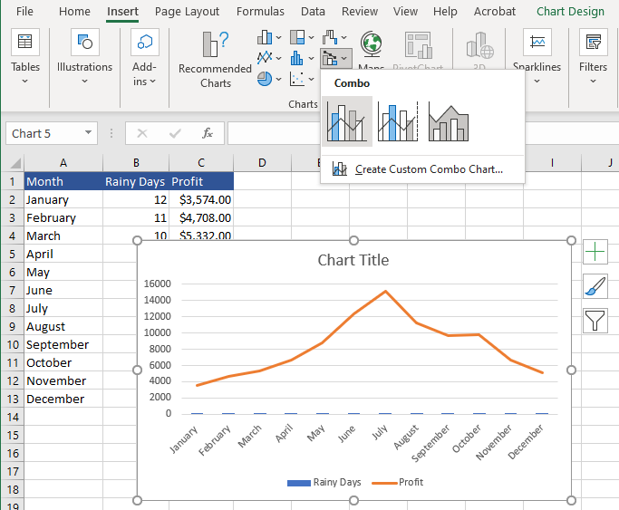
Simply keep your data set highlighted, then use the drop-down arrow next to each category of chart type to try out various options on your data.
Experimentation Can Lead to Great Things
Microsoft Excel’s charting functionality has a multitude of options and customizations. The best way to get started is to make sure you have all of the data you need in your table, then highlight it and start hovering over chart and formatting options to see which make the most sense.
If you have any questions about your Microsoft 365 applications, or if you’d like to know how to make sure that your staff has online access to them from anywhere at any time, just contact us. We help companies optimize enterprise-level tools at small business prices every day.